A tale of two aunties – the registration of stylised trade marks
It is conventional wisdom that registering a trade mark in plain word format provides a business with the strongest rights in the verbal content of the mark in order to keep competition at bay. However, a recent Board of Appeal (EUIPO) decision1 has illustrated that the matter is not always so straightforward and that being able to tackle unwanted competition requires sound advice and strategic portfolio planning. Louis Pittortou, trade mark attorney and partner, explains that there may be instances where registering the stylised or logo version of your mark may put you in a better position to take action against others adopting something similar.
The decision addressed the efforts of Aunt Bessie’s Limited to challenge an EU Trade Mark (EUTM) application to register an AUNT BERTA’S logo for identical goods. As will be seen below, the decision is of particular relevance for markets where the goods are bought on sight such as in the food and drinks sector.
Background
The Board of Appeal had to consider the similarity, or otherwise, of the AUNT BESSIE’S trade mark, registered without any stylisation, against an application to register the following stylised Aunt Berta’s trade mark for identical goods:
![]()
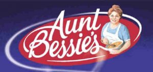
It should be noted that Aunt Bessie’s Limited did not rely on any rights in its own stylised trade mark, detailed below:

Decision
In the first instance, the Opposition Division of the EUIPO had found the AUNT BERTA’S logo to be aurally and visually similar to the AUNT BESSIE’S word mark. This, coupled with the identity of the goods, resulted in a decision in favour of the Opponent, Aunt Bessie’s.
However, the decision was annulled on appeal. The Board of Appeal maintained that the goods were identical, but found that the marks were sufficiently different for there to be no likelihood of confusion on the part of the public.
For those EU consumers familiar with English, the first word in each mark would be perceived as “Aunt”, a simple qualifier of the names Bessie and Berta which are not similar. For those consumers not familiar with English, the first word would be meaningless, but would still be perceived as qualifying the different names. In each scenario, the Board of Appeal held that the marks were visually and aurally dissimilar.
Opinion
There is nothing particularly new or surprising in the above. However, the following aspects of the decision are of particular note:
- The Board acknowledged that the conflicting goods of both parties are basic consumer goods which will be arranged on shelves in supermarkets such that the consumer will be guided more by the visual impact of the mark; and
- The low degree of similarity between the marks is further weakened by the fact that the stylisation in the AUNT BERTA’S mark has no counterpart in the AUNT BESSIE’S word mark.
The Board did not address the similarities between the Aunt Berta’s stylised mark and the Aunt Bessie’s stylised mark because the opposition was not based on any rights in the same.
One can only speculate as to whether the similarities between the two stylised marks would have been sufficient to result in the refusal of the Aunt Berta’s application. However, each mark represents the words in stylised, conjoined, handwritten text and makes prominent use of the colour red. This may well have been enough to tip the balance in Aunt Bessie’s favour, particularly given the importance placed on visual similarities for such goods.
This case highlights the potential value of registering the stylised version of your mark in addition to the plain word mark. There may be instances where the stylisation will make all the difference (or rather similarity).
For more information or advice, please contact Louis Pittortou or your usual Barker Brettell attorney.
1 Beth El Food Ltd v Aunt Bessie’s Limited R0740_2015-4, 4 December 2015


